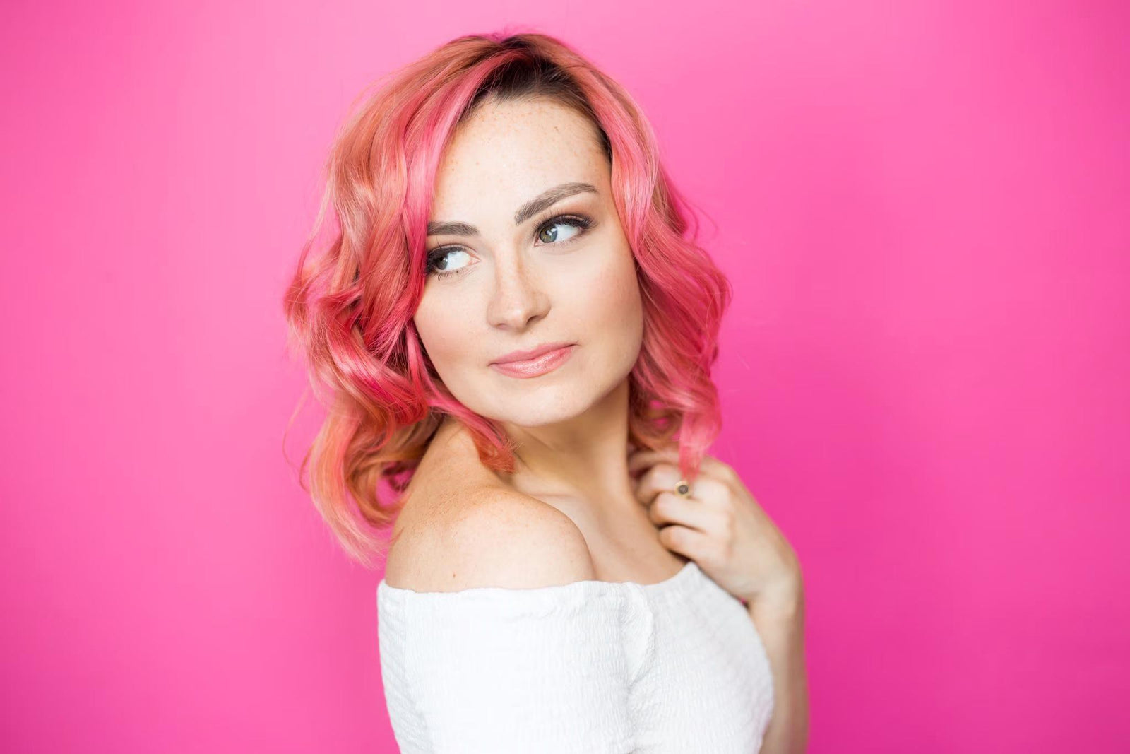

Molly Burke, a blind YouTuber, content creator, and makeup artist chats with us about how the beauty industry can be more inclusive for blind people and others within the disabled community. She also touches on how people who are blind determine which product to use.
Molly says, “Historically the beauty and fashion industry hasn’t been the most eager to represent blind or disabled people. It’s been a pretty exclusive industry in general. But thankfully, we are starting to progress. It’s amazing, and I’m really hoping we’re moving toward disability inclusion in terms of making packaging more accessible. There are lots of things that can be done for all disabilities, but I’m going to speak from my perspective, and what I know would help me.”
#1 Square packaging
“Square packaging that can’t roll is super helpful. As a blind person, I knock things over, and when it rolls, I can’t always find it. So, square packaging or role-proof packaging is great.”
“Also, pop tops are great. When it’s a twist-off cap, it’s difficult because it’s something that can fall and get lost whereas pop-tops are attached. That really helps.”
#2 Textural packaging
“Textural packaging helps get some grip differences. Braille also helps me read the packaging and ingredients. That way, I don’t have to ask anyone. Tactile QR codes also help so that you can scan it and your phone can read it. I love how Herbal Essence has tactile stripes on their shampoo bottles and tactile circles on the conditioner bottles. I also like Indie Beauty which is a vegan, cruelty-free beauty brand owned by a mom who has a blind child. All of her products have tactile symbols that represent different products. So, instead of using braille, which is not universal, she uses tactile symbols which are. Many people can benefit from this.”
Similarly, too-faced does this unintentionally, but all of their products have distinctive smells. Their packaging is all raised, and a lot of it has texture. For example, the packaging for their waterproof “better than sex” mascara has a texture that reminds me of water droplets. That helps me to know what it is.
#3 Bright-colored packaging
Large fonts and bright-colored packaging help. When all your products are in different colors, you can associate colors with specific products. Drunk Elephant is doing that well with putting the distinct colorful tops against the white bottle. I don’t see color though so it’s hard for me to think of other examples.
#4 Different shapes
It really helps when the bottles are different shapes from each other. Sometimes shampoos and conditioners are like this, and this is becoming more common which I think is great.
We’re moving in the right direction. I celebrate the small changes that brands make, and it’s important to emphasize them. Doing this encourages the brand to continue making progress, and it helps them know that they’re moving in the right direction.